FLOURISH


Logo design
Branded clothing
Brand development
ABOUT THE PROJECT
When friends of ours contacted us about designing an identity for their new venture in to vegan catering, we jumped at the chance to help them develop their new brand identity.
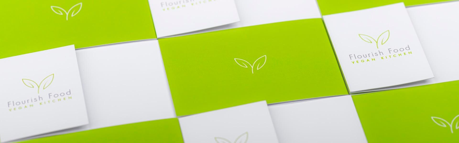
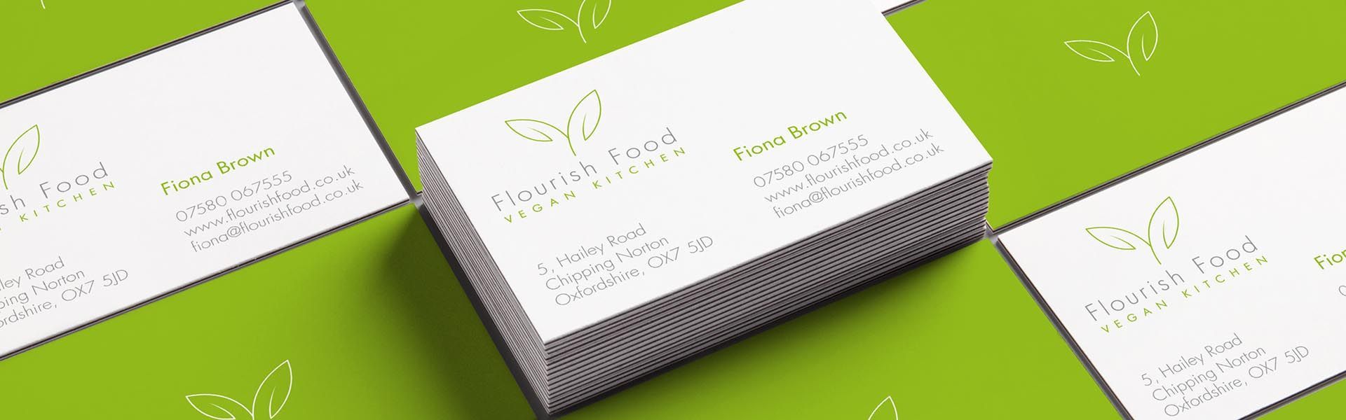
With inspiration taken from our client's child's drawing of a daffodil, we used the naïve leaf-form and developed this in to a clean and sophisticated logotype. We added to the logo with the clean look of Paul Renner's Futura typeface, with subtle refinements to the stem of the 'h' in 'Flourish' which leads in to the stem of the leaf-form.
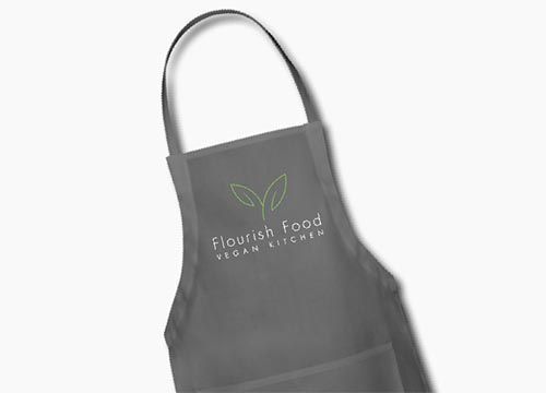
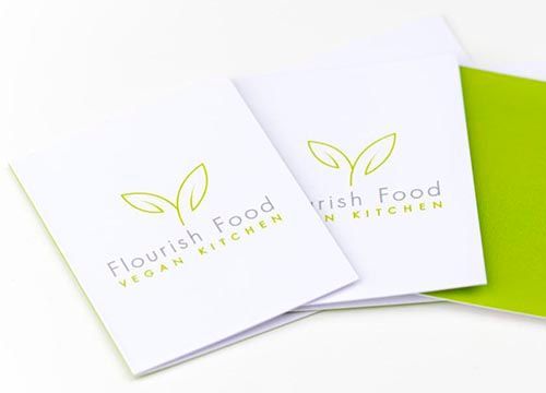
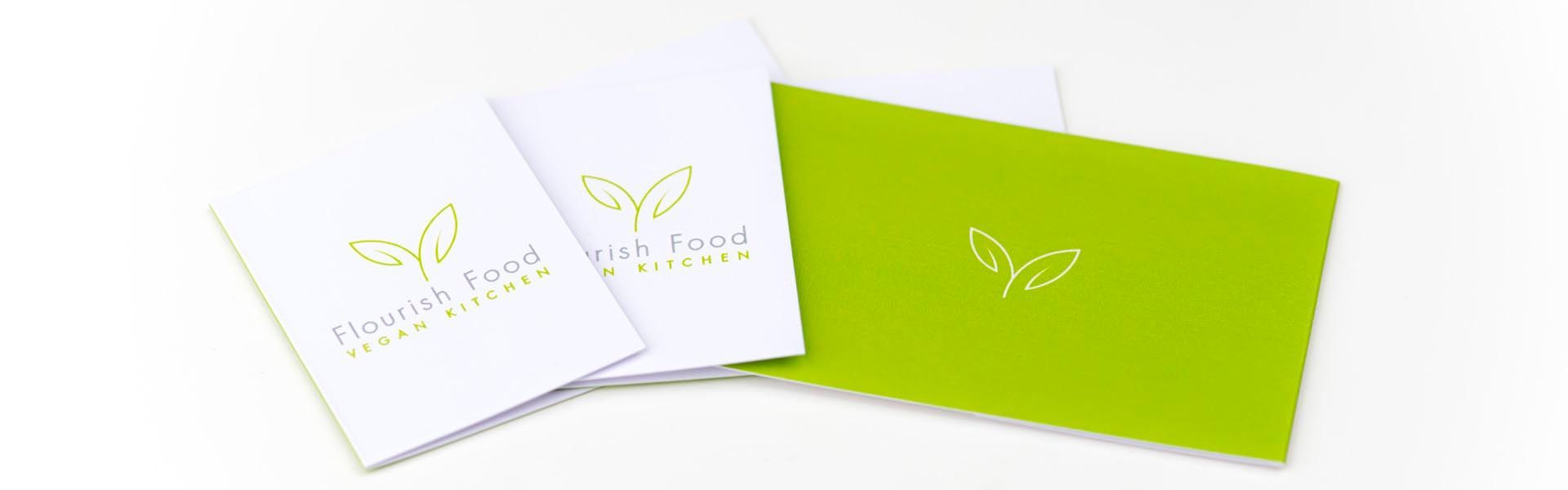
We chose a colour palette of modern, sophisticated food-oriented colours; a zingy lime green complemented by charcoal grey, and produced printed business cards on a linen-textured specialist paper which neatly double as labels which can be used for dishes. We also produced some rather smart pinnys for the serving staff to use at their events, which were flex printed for crispness of detail and ease of care as they will be washed daily.
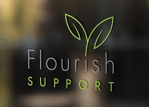
Recently, our client has diversified and we were asked to produce a logo variant for 'Flourish Support' – and we were only to happy to oblige!
WHAT OUR CLIENT SAID
“Good branding is critical to a new business. It can help you define what your business is about as well as communicating this to your customers. Ampersandesign not only created a stunning logo which reflected my vision for the business but also led me through some of the critical first steps in establishing and implementing a business idea. Dave is a true professional, hugely talented and an inspiration to anyone starting or growing a business.”
Fiona Brown
Director, Flourish Food